This is the second of a series of my posts on the key take ways from the recently concluded Project Management National Conference 2014 in Hyderabad, India. This is my interpretation of the concepts presented in the conference.
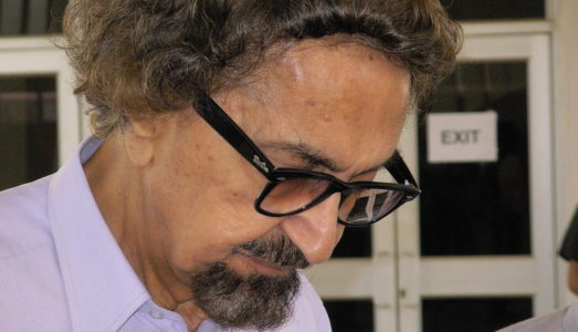
Alyque Padamsee awed us with his inspirational speech on the qualities of leadership. He said, it was Vision, Charisma, Courage, Empathy, Delegation, Feedback and Motivation that makes a leader. While it was an amazing speech, I will write about one of the few super things that caught my attention most.
[tweet https://twitter.com/pjnjmj/status/510825334099304449]
Keep It Simple
His slides were crisp, clear and each of them had just one point. There were no animations, themes, or colours. Everyone waited with bated breath to see his next slide and once the slide came up, waited for him to throw light on it. The kind of effect that this had on the audience was that it was an instant connect.
We do so much to jazz up our presentations and squeeze in too many points, but with very little effort and a pristine white theme, the ad guru, drove the point home. The message that the slide wanted to was conveyed.
What I learnt from this was –
- Never ever have more than 3 distinct points in a given slide. 1 is even better
- Don’t wait for themes and animations and other features of power point to drive the point, you should do it.
- Keep your slides – crisp, clear and concise
Let me know your thoughts and experiences on this topic by dropping in your comments. Lets discuss.
I have saved the other juicy take-aways from Mr. Padamsee for another post.
Image: Wikimedia Commons
